Ten percent more bookings, one season.
This is a booking platform based in Iran, so the product language is Farsi. But the case study is written in English.
Interim UI/UX Designer
I joined a product team as a junior UI/UX designer for hands-on experience. My responsibilities included:
Increasing monthly bookings in high season by 10% (Year over year)
Our team was given this general goal by the management team, and how we would tackle it in the product, was up to us.
UX discovery
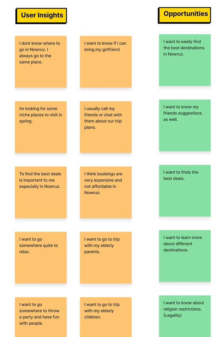
Brainstorm #1 preparation, user insights and how I conducted it
I prepared our user insights from previous user interviews and customer support reports and put the relevant ones on the preparation whiteboard. Then asked the question:
How can we as a product team, Increase the booking per month by 10%
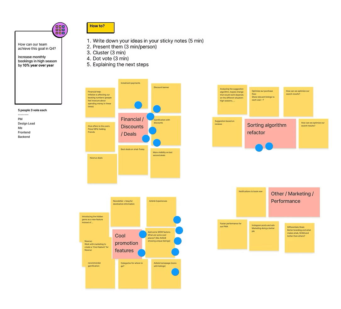
Each person gets 5 minutes to write down their ideas on sticky notes in FigJam
Then each person gets 3 minutes to explain their ideas and choose their best one
In the end, we cluster the ideas together and dot vote on what we want to tackle and prioritize
Let’s work on cool promotion features
As we did the previously mentioned method of brainstorming, we gathered some ideas and our main goals became researching more about:
Preparation for brainstorm #2
Doing competitor analysis and benchmark. I researched all the prominent local competitors and international websites to see if they had similar features and if so, how they were designing it
No local competitors had cool factor listings
None of our local competitors had a cool factor listings section and they all promoted “Popular cities” which we were already doing. But interesting enough, almost all the international ones had some kind of cool factor sections.
So we did a second brainstorm and came up with an idea for “Good for spring trips” feature. After that, I started doing user interviews, user flows and etc.
What the users were looking for
From my user interviews, I found out these important factors:
Users wanted to go to cool and niche cities
The weather was important
Important how unique the places were
What they could do in the area
So I repurposed some filters we already had and proposed some new filters as well
Testing out what it could look like
So I sat down and got to work. Designed a couple of iterations and came up with I liked the most and seemed simple enough to use.
Added an image to convey the feeling of Spring
I added a “Filter bar” with tags such as: Show All - In the mountains - Woods - Beaches - Deserts
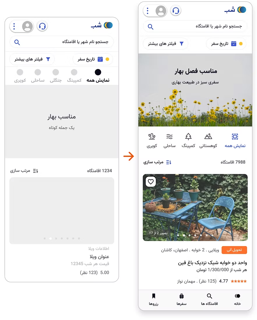
The design lead thought the page looked cluttered at the top, so I moved the bar under the image to give it room to breathe.
What the tests told us to change
I conducted usability tests online with external users (users who don’t work in the company). Here are the results:
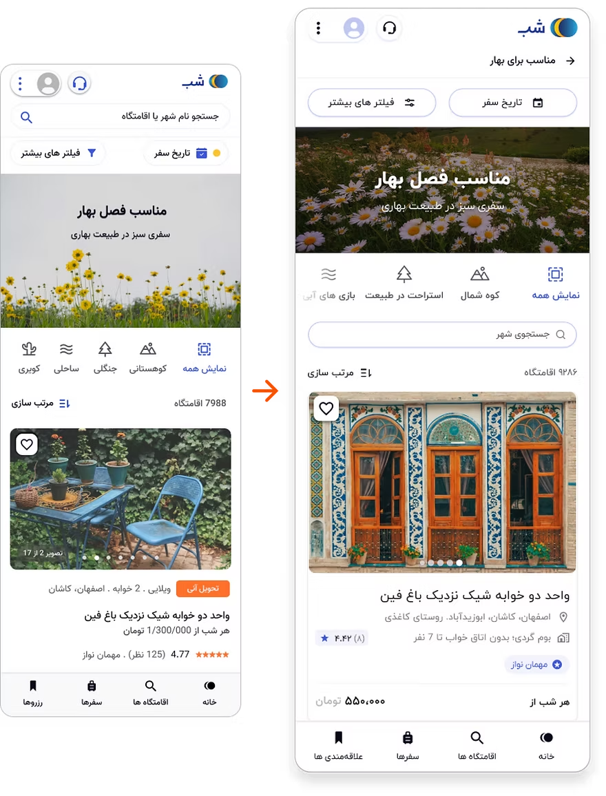
The users wanted to narrow down cities (Inner search bar)
We could spice up the texts on the filter to engage users a bit more
Instead of saying “Near beaches” we could say “Water Sports” or instead of “In Woods” we could say “Relax in Nature”
The image was too big on small devices
The accent color (blue) being used on many icons was a bit distracting
Removed the top main search bar to keep users on the landing page
We added a list of 40 cities manually in the backend (based on my research)
A better usability score, and faster decisions
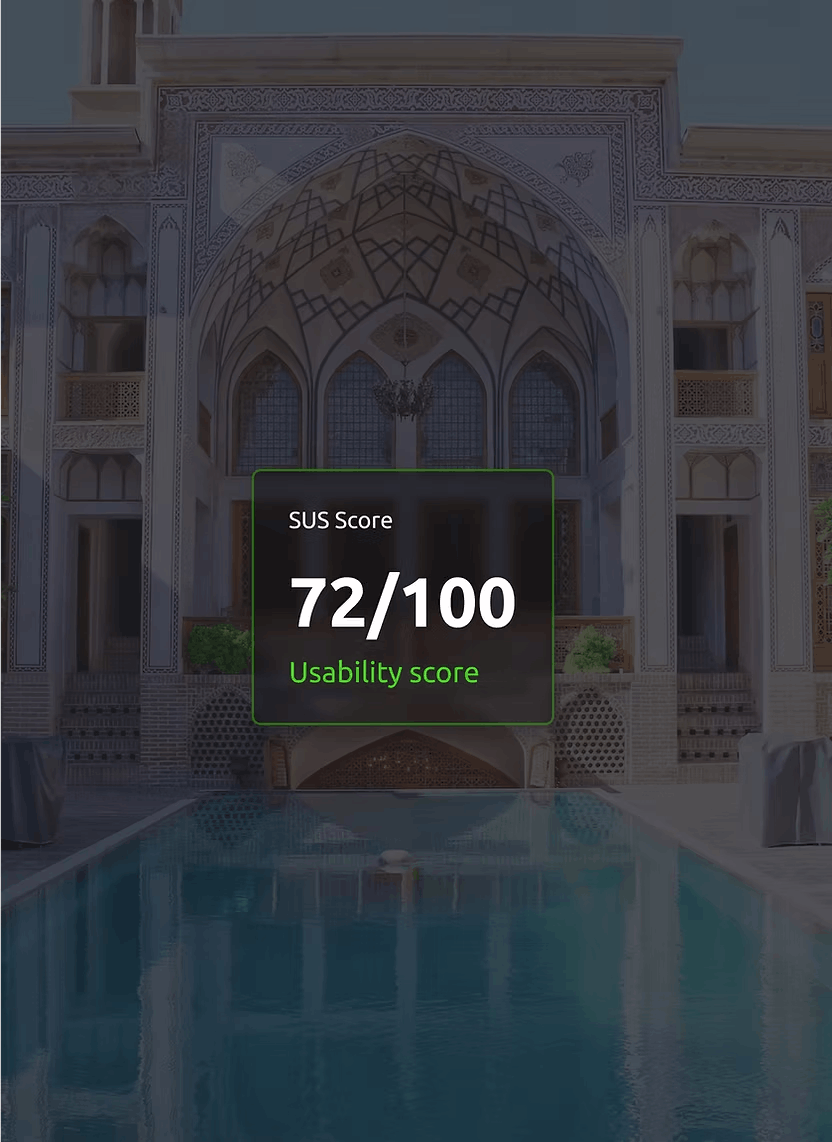
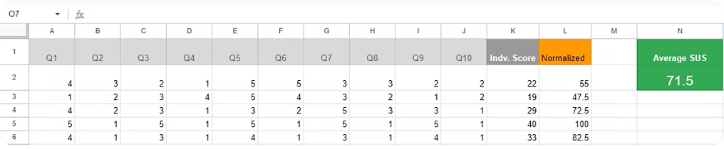
Testing the usability with new external users, resulted in a much better Usability score for the landing page and faster decision times.
I think that I would like to use this system frequently.
I found the system unnecessarily complex.
I thought the system was easy to use.
I think that I would need the support of a technical person to be able to use this system.
I found the various functions in this system were well integrated.
I thought there was too much inconsistency in this system.
I would imagine that most people would learn to use this system very quickly.
I found the system very cumbersome to use.
I felt very confident using the system.
I needed to learn a lot of things before I could get going with this system.
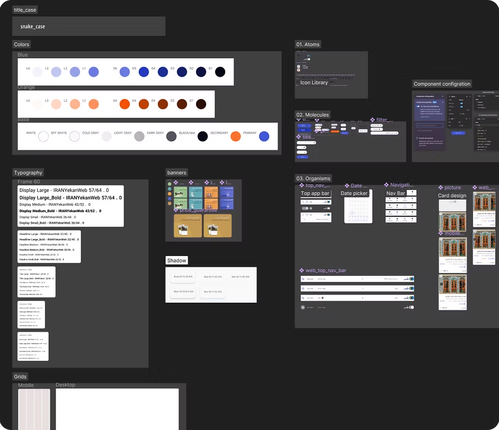
Atomic design system by me
Since Shab transitioned into using Figma from Adobe XD for this project (and their future ones), I had to create the elements we needed in a completely fresh design system file.
I created all the style guides such as typography, colors, shadows, and grids. I also created the components needed for these designs in a very customizable and developer-friendly way.
I owe most of these skills to watching YouTube videos, and asking questions from my mentors when things became too confusing.
Final designs
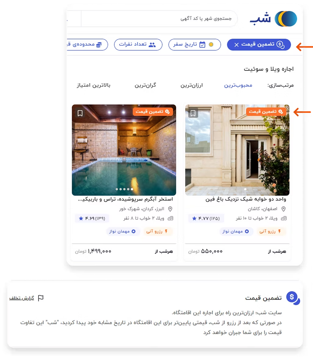
Business Info Dept. helped us create a financial help feature
After considering it carefully and taking a look at the numbers, the BI department came up with the idea of “Price Guarantee”.
Some listings are tagged with “Price Guarantee” label and if anyone finds the same listing and host with a lower price, they can report it and get a refund.
This not only controlled hosts so they don’t post it with higher prices on Shab but also put guests' minds at ease that they’re getting the best deal.
How I redesigned our banners and increased CTR
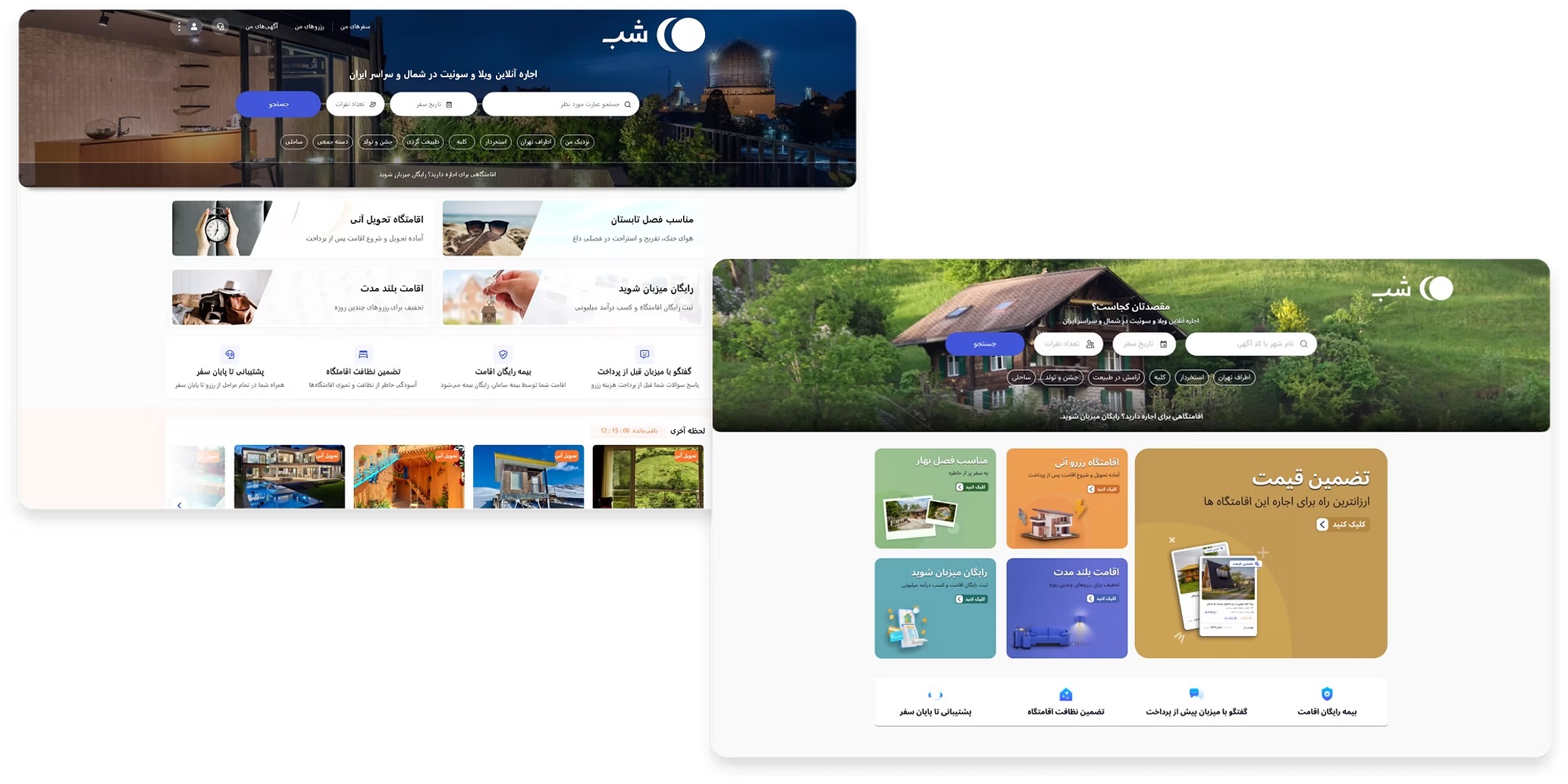
So to promote our features, we wanted to reuse our banners section of the Homepage and Home Tab on the apps.
The problem was that the banners blended in with the light backgrounds and were not super eye-catching, so I proposed these new designs that are live now!
So did we achieve our goal?
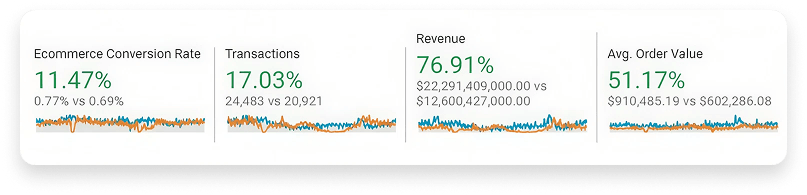
It’s very early to say since we released the feature about a month ago, but so far, Yes we did make a huge difference! (With seasonality in mind)
So what did I learn?
Learning from my superiors was an extremely enjoyable experience. Putting into practice a lot of theoretical stuff was very inspiring.
Working in a psychologically safe environment helped me take risks and they encouraged smart failures.
As a junior designer, the seniors trusted my judgment and coached me along the way to conduct my own sessions and come to conclusions.
Feasibility challenges with Devs, PMs, and stakeholders early and continuously are super important. You’ll get many more sets of eyes and insights you might have never considered (especially as a junior)